


The complete color guide — which tone may fit your room, your lighting, and your style
The Silentwood Colors in Detail
Light Oak — the Scandinavian all-rounder
A light, natural oak tone with subtle grain. Light Oak can bring brightness into a room and tends to fit the Scandinavian interior style that has been popular in Germany for years.
Often matches with: White walls, grey sofas, light wood floors (birch, maple, light oak), modern kitchen fronts. One of the most universal tones in the range.
Often works well in: Darker rooms without windows (hallways, windowless bedrooms), small rooms (under 12 m² — the light tone can help open up the space), rooms with lots of daylight (it tends to reflect light and feel lively).
Be careful with: Cream or yellow-toned walls — Light Oak can appear slightly washed out next to warm whites. In that case, Light Brown Oak may be the better choice.
Light Brown Oak — the warm compromise
An in-between tone: warmer than Light Oak, lighter than Smoked Oak. Light Brown Oak has a more pronounced grain and a golden undertone that can add warmth without darkening the space.
Often matches with: Wooden furniture (oak, walnut), earthy tones (beige, terracotta, olive green), linen and natural fabrics. A tone that tends to blend naturally into existing interiors.
Often works well in: Living-dining areas with existing wooden floors, bedrooms with medium brightness, rooms where neither too light nor too dark is desired.
Be careful with: Very modern, minimalist interiors — the golden undertone can feel too rustic. Light Oak may be more consistent here.
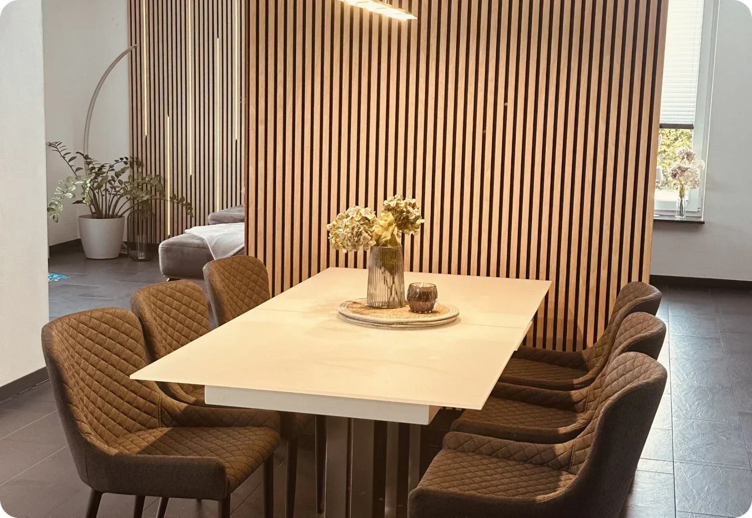
Smoked Oak — a customer favorite ⭐
A medium-to-dark brown tone with deep, expressive grain. Smoked Oak is one of our most chosen finishes. The reason: it tends to work in many different settings and can add warmth and quality without being overpowering.
Often matches with: Grey, white, and dark furniture alike. Leather, velvet, cotton. Wood floors (including dark ones), tile floors, carpet. One of the most versatile tones in the range.
Often works well in: Living rooms (accent wall behind sofa), bedrooms (headboard wall), home offices (as a professional video call background), wardrobes and hallways.
Be careful with: Very small, dark rooms without windows — it can feel heavy. In those cases, Light Oak or Light Brown Oak may be a better fit.
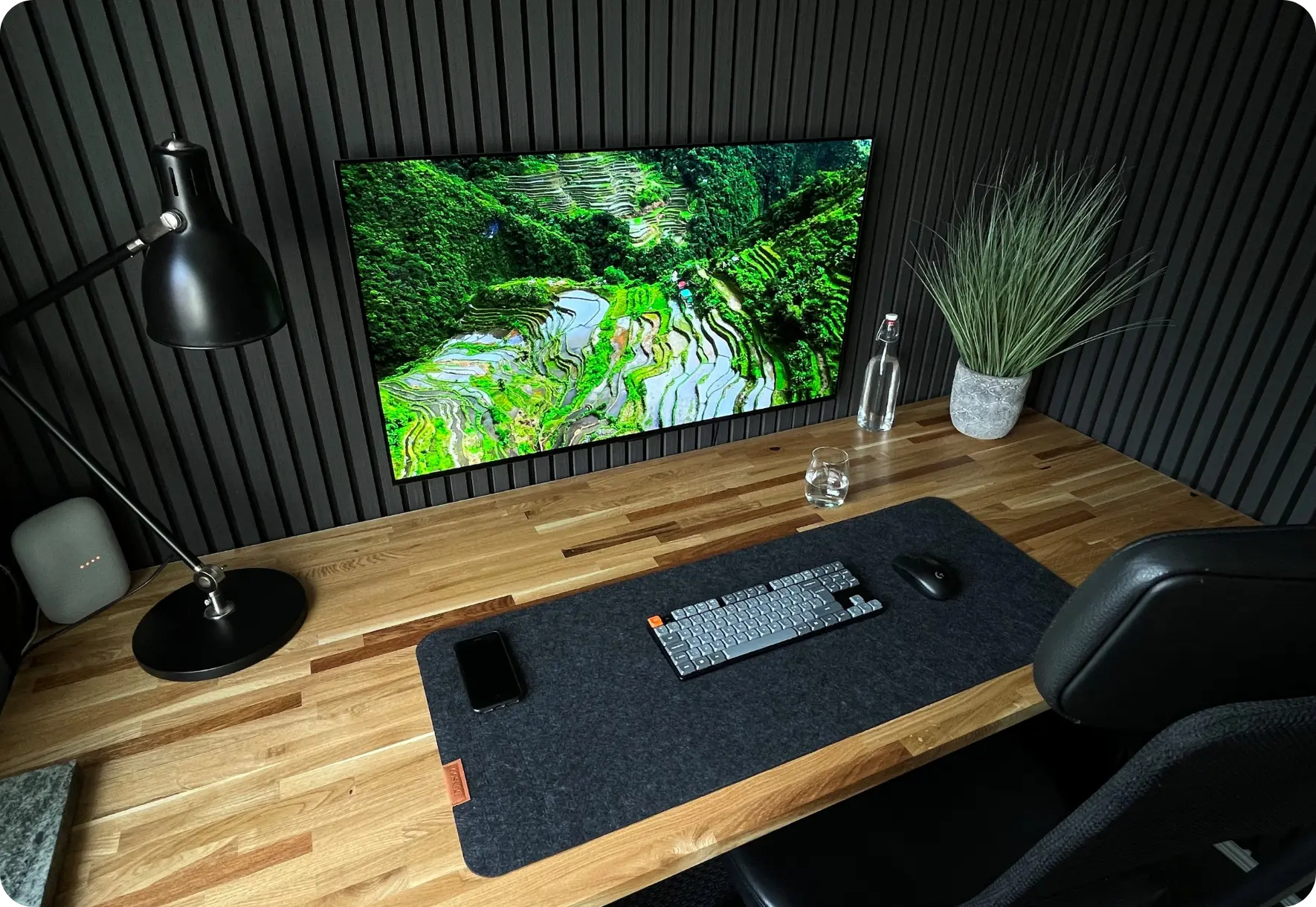
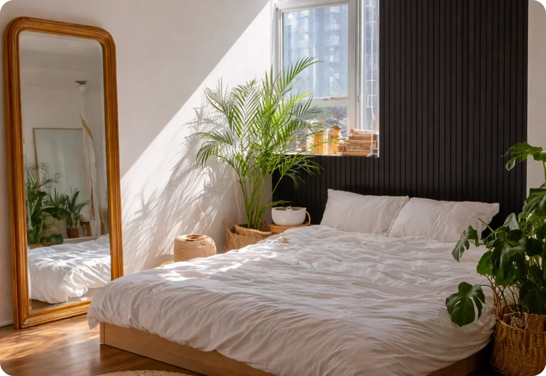
Black Oak — the bold statement
A deep, almost black oak tone with subtle grain. Black Oak is among the most dramatic finishes — it can create depth, contrast, and a modern architectural look. Not for every space, but where it works, the effect can be stunning.
Often matches with: White or light grey walls (strong contrast), brass and gold accents, modern furniture. Also industrial styles with concrete and metal.
Often works well in: TV walls (the screen may visually disappear), larger living rooms, rooms with high ceilings, lofts, bright entryways. More: black acoustic panels.
Be careful with: Small rooms, low ceilings, or spaces without natural light — it can feel overwhelming.
Color Decision Guide
| Your room | Recommended tone | Why |
|---|---|---|
| Small + dark (hallway, bathroom) | Light Oak | Can reflect light and help open up the space |
| Medium + daylight | Smoked Oak | One of the most versatile tones, tends to fit most interiors |
| Large + bright | Smoked Oak or Black Oak | Darker tones can add contrast without overwhelming |
| Older building + stucco | Smoked Oak | Warm tone can complement classic character |
| Scandinavian/minimalist | Light Oak | Bright, clean, style-consistent |
| Rustic/country house | Light Brown Oak | Golden undertone, natural warmth |
| Modern/industrial | Black Oak | Strong contrast with concrete, metal, glass |
| TV wall | Black Oak or Smoked Oak | Darker tones can make the TV visually disappear |
| Video call background | Smoked Oak | Often flattering for skin tones in webcam lighting |
Felt Variants
Some Silentwood colors are also available with a grey felt surface visible between the slats. The grey felt can create additional contrast and depth — potentially making the slats appear more three-dimensional. Whether you choose visible felt or not is purely a matter of taste. Both versions are typically included in the sample box.
Why You Should Order the Sample Box
The most important advice in this guide: don't rely on your screen. Every monitor displays colors differently. What looks like Light Oak on your laptop may look like Smoked Oak on your phone. On top of that, daylight, artificial light, and LED color temperature can dramatically change how colors appear.
The free sample box includes all colors as real material samples. Hold them against your wall, in your lighting, next to your furniture — in the morning and in the evening. That's how you can make a decision you're less likely to regret.
Frequently Asked Questions
That depends on your space, lighting and existing interior. Smoked Oak tends to be versatile and fits many interior styles — it's one of our customer favorites for a reason. For bright Scandinavian spaces, Light Oak may be the better match. For bold modern statements, Black Oak can be a strong choice. When in doubt: order the sample box and test in your own lighting.
Light Oak tends to work best here. The light tone can reflect available light and visually push the walls outward. In small rooms or windowless hallways, Light Oak is often a better fit than darker tones.
We generally recommend a single color per wall and room. Multiple tones within the same field of view can feel visually restless. Between rooms, variation tends to work well — e.g. Smoked Oak in the living room, Light Oak in the hallway.
Black Oak or Smoked Oak are often strong choices. Darker tones can make a switched-off screen visually disappear and create a more cinematic atmosphere. Lighter tones (like Light Oak) may feel too high-contrast next to a black TV frame. More: TV wall design.
Not always — screens can struggle to reproduce wood tones accurately. Monitor calibration and room lighting both affect perception. That's why we offer a free sample box: real material samples you can test on your wall in your own lighting — one of the most reliable ways to evaluate the look before buying.
Conclusion: Test Before You Decide
The right color is the one that looks good in your room, in your lighting, and next to your furniture — not the one that looks best on a screen. Order the free sample box, hold the samples against your wall, and decide calmly. It costs nothing and can help you avoid the most common mistake: choosing the wrong color.
Color perception varies based on lighting, monitor calibration and individual preference. Material samples are recommended for final decisions. Prices mentioned in this article correspond to the current prices at the time of publication and are subject to change.


Hozzászólás írása
Ezt a webhelyet a hCaptcha rendszer védi, és a hCaptcha adatvédelmi szabályzata, valamint szolgáltatási feltételei vonatkoznak rá.